A modal is a dialog box/popup window that is displayed on top of the current page:
How To Create a Modal Box:
Step 1 : ADD HTML
<h2>Modal Example</h2>
<!-- Trigger/Open The Modal -->
<button id="myBtn">Open Modal</button>
<!-- The Modal -->
<div id="myModal" class="modal">
<!-- Modal content -->
<div class="modal-content">
<span class="close">×</span>
<p>This is an example of Modal / Dailogue box </p>
</div>
</div>
Step 2 : ADD CSS
body {font-family: Arial, Helvetica, sans-serif;}

/* The Modal (background) */
.modal {
  display: none; /* Hidden by default */
  position: fixed; /* Stay in place */
  z-index: 1; /* Sit on top */
  padding-top: 100px; /* Location of the box */
  left: 0;
  top: 0;
  width: 100%; /* Full width */
  height: 100%; /* Full height */
  overflow: auto; /* Enable scroll if needed */
  background-color: rgb(0,0,0); /* Fallback color */
  background-color: rgba(0,0,0,0.4); /* Black w/ opacity */
}

/* Modal Content */
.modal-content {
  background-color: #87ceeb;
  margin: auto;
  padding: 10px;
  border: 3px solid #fff;
  width: 90%;
}

/* The Close Button */
.close {
  color: #fff;
  float: right;
  font-size: 28px;
  font-weight: bold;
}

.close:hover,
.close:focus {
  color: #000;
  text-decoration: none;
  cursor: pointer;
}
Step 3 :ADD JavaScript
<script>
// Get the modal
var modal = document.getElementById("myModal");

// Get the button that opens the modal
var btn = document.getElementById("myBtn");

// Get the <span> element that closes the modal
var span = document.getElementsByClassName("close")[0];

// When the user clicks the button, open the modal
btn.onclick = function() {
  modal.style.display = "block";
}

// When the user clicks on <span> (x), close the modal
span.onclick = function() {
  modal.style.display = "none";
}

// When the user clicks anywhere outside of the modal, close it
window.onclick = function(event) {
  if (event.target == modal) {
    modal.style.display = "none";
  }
}
</script>
Full Code Will be Something like this
<!DOCTYPE html>
<html>
<head>
<meta name="viewport" content="width=device-width, initial-scale=1">
<style>
body {font-family: Arial, Helvetica, sans-serif;}
/* The Modal (background) */
.modal {
display: none; /* Hidden by default */
position: fixed; /* Stay in place */
z-index: 1; /* Sit on top */
padding-top: 100px; /* Location of the box */
left: 0;
top: 0;
width: 100%; /* Full width */
height: 100%; /* Full height */
overflow: auto; /* Enable scroll if needed */
background-color: rgb(0,0,0); /* Fallback color */
background-color: rgba(0,0,0,0.4); /* Black w/ opacity */
}
/* Modal Content */
.modal-content {
background-color: #87ceeb;
margin: auto;
padding: 10px;
border: 3px solid #fff;
width: 90%;
}
/* The Close Button */
.close {
color: #fff;
float: right;
font-size: 28px;
font-weight: bold;
}
.close:hover,
.close:focus {
color: #000;
text-decoration: none;
cursor: pointer;
}
</style>
</head>
<body>
<h2>Modal Example</h2>
<!-- Trigger/Open The Modal -->
<button id="myBtn">Open Modal</button>
<!-- The Modal -->
<div id="myModal" class="modal">
<!-- Modal content -->
<div class="modal-content">
<span class="close">×</span>
<p>This is an example of Modal / Dailogue box </p>
</div>
</div>
<script>
// Get the modal
var modal = document.getElementById("myModal");
// Get the button that opens the modal
var btn = document.getElementById("myBtn");
// Get the <span> element that closes the modal
var span = document.getElementsByClassName("close")[0];
// When the user clicks the button, open the modal
btn.onclick = function() {
modal.style.display = "block";
}
// When the user clicks on <span> (x), close the modal
span.onclick = function() {
modal.style.display = "none";
}
// When the user clicks anywhere outside of the modal, close it
window.onclick = function(event) {
if (event.target == modal) {
modal.style.display = "none";
}
}
</script>
</body>
</html>
Output :

How to create a Modal Box / Dialogue Box with CSS and JavaScript
You may Also Like


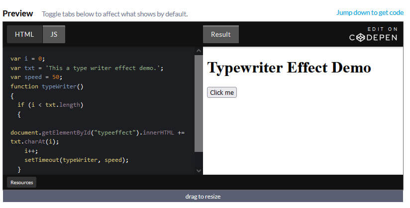
How to add Typing Effect / Type Writer Effect to your text Using JavaScript
By Richard
/ June 5, 2022
How to add Typing Effect / Type Writer Effect to your text Using JavaScript Step 1) Add HTML: <h1>Typewriter</h1>...
Read More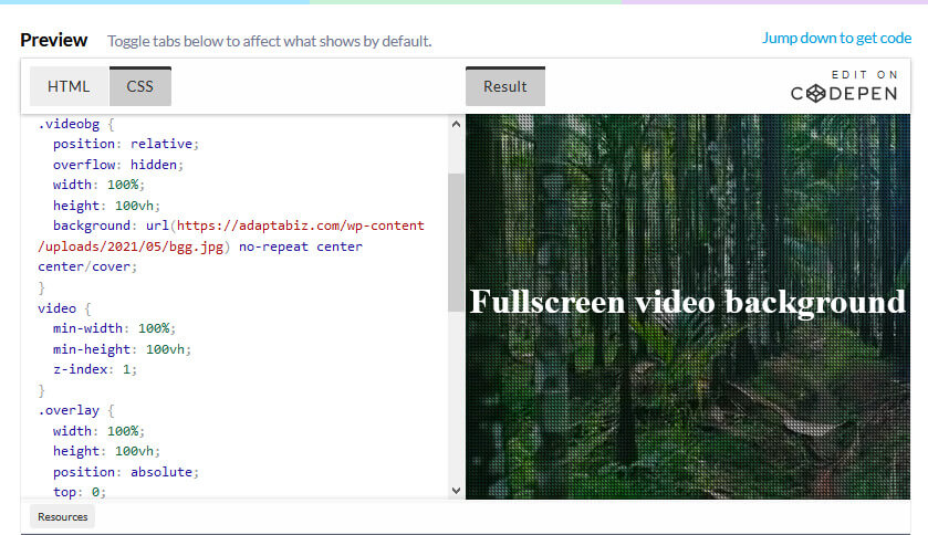
How to Create a full screen video background using HTML, CSS
By Richard
/ May 22, 2022
Learn How to Create a full screen video background using HTML, CSS Adding HTML <div class="videobg"> <video src="https://adaptabiz.com/wp-content/uploads/2021/05/Pexels-Videos-1234162.mp4" loop muted...
Read More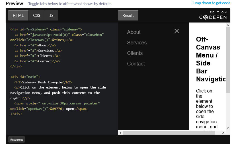
How to Create an Off-Canvas Menu / Side Bar Navigation
By Richard
/ April 29, 2022
How to Create an Off-Canvas Menu / Side Bar Navigation Step 1) Add HTML: <div id="mySidenav" class="sidenav"> <a href="javascript:void(0)" class="closebtn"...
Read More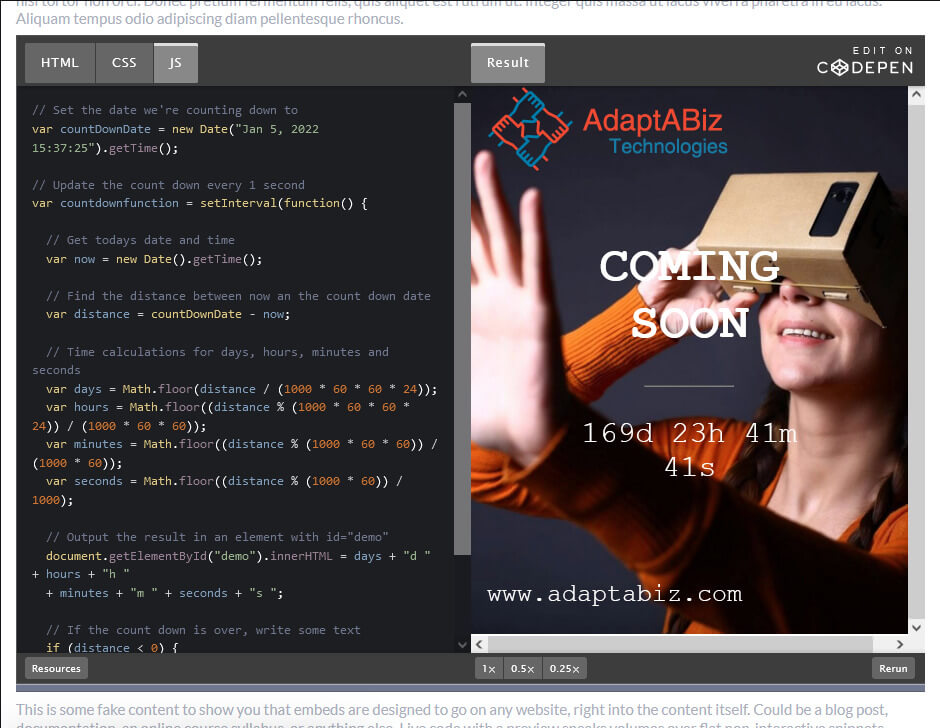
How To Create a Coming Soon Page / Maintenance Page Using HTML, CSS and JavaScript
By Richard
/ April 19, 2022
How To Create a Coming Soon Page / Maintenance Page Using HTML, CSS and JavaScript Step 1 : Adding...
Read More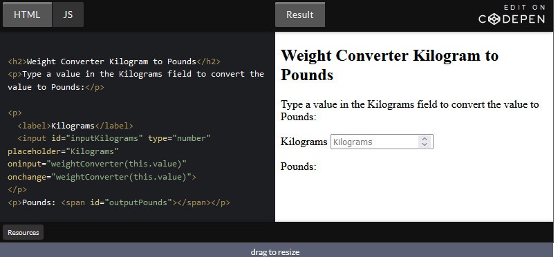
How to Create Weight Converter using HTML and JavaScript
By Richard
/ April 2, 2022
How to Create Weight Converter using HTML and JavaScript For Converting Pounds to Kilogram Adding HTML : <h2>Weight Converter Pound...
Read More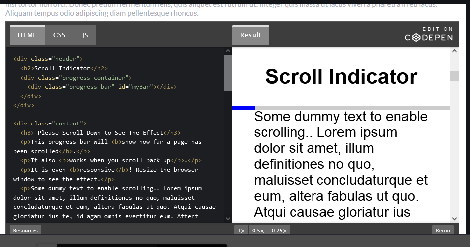
How to create a Scroll indicator with CSS and JavaScript
By Richard
/ February 19, 2022
How to create a Scroll indicator with CSS and JavaScript Step 1) Add HTML: <div class="header"> <h2>Scroll Indicator</h2> <div...
Read More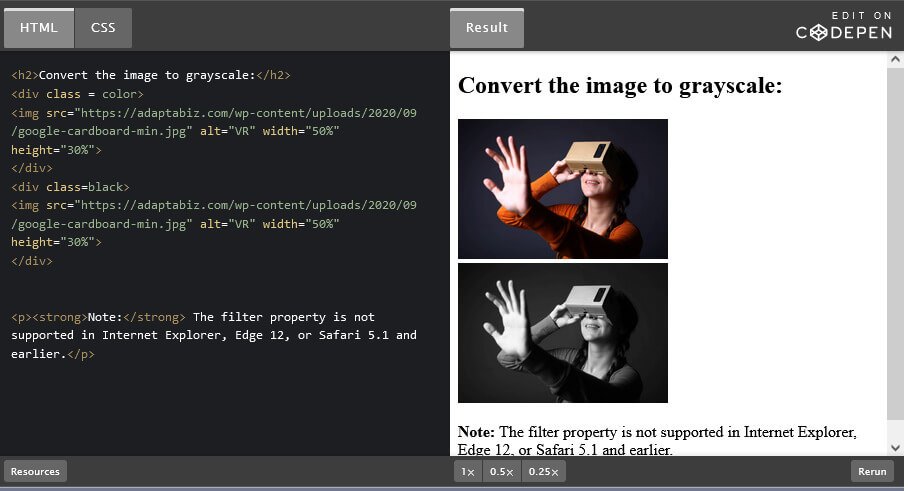
How to Convert Color image to Black & White using CSS Filter ( Color to Grayscale)
By Richard
/ February 15, 2022
Many a times, there is necessity of converting Color image into Black and White or Grayscale. Here in this very...
Read More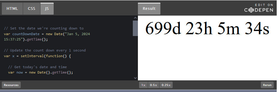
How to Create a JavaScript Countdown Timer
By Richard
/ February 4, 2022
There are many a times, when you’re going to need a countdown clock for your project. You may have an...
Read More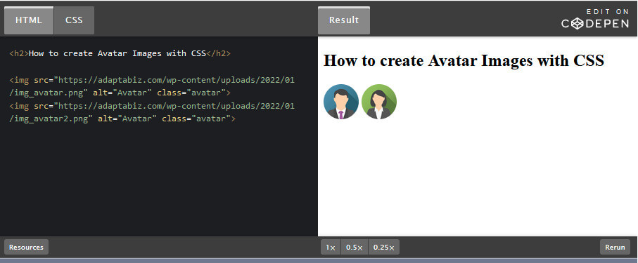
How to Create an Avatar image with CSS
By Richard
/ January 20, 2022
How to Create an Avatar image with CSS Step 1) Add HTML: <h2>How to create Avatar Images with CSS</h2> <img...
Read More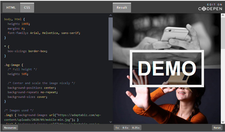
How to Change Background Images on Scroll with CSS.
By Richard
/ January 13, 2022
How to Change Background Images on Scroll with CSS. Step 1) Add HTML: <div class="bg-image img1"></div> <div class="bg-image img2"></div>...
Read More