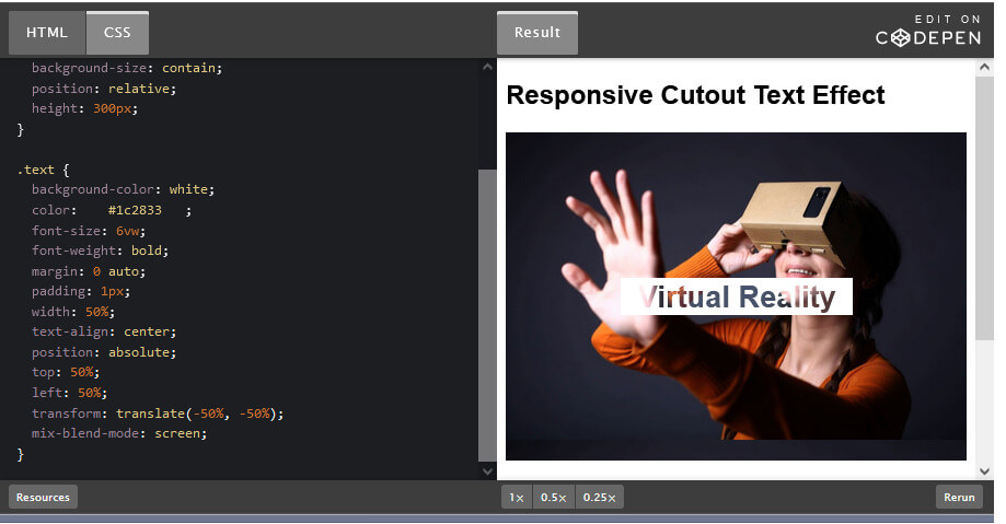
A cutout text (or knockout text) is a see-through text that appears cut out on top of a background image
How to Create a Responsive Cutout/Knockout text with CSS
Step 1) Add HTML:
<h2>Responsive Cutout Text Effect</h2>

<div class="image-container">
  <div class="text">Virtual Reality </div>
</div>

<p>This example creates a responsive cutout text/knockout text - text that appears cut out on top of a background image.</p>
<p>Resize the browser window to see the responsive effect.</p>
<p><strong>Note:</strong> This example does not work in Internet Explorer or Edge.</p>
Step 2) Add CSS:
The mix-blend-mode property makes it possible to add the cutout text to the image. However, it is not supported in IE or Edge:
body {font-family: Arial, Helvetica, sans-serif;}

.image-container {
  background-image: url("https://adaptabiz.com/wp-content/uploads/2020/09/google-cardboard-min.jpg");
  background-size: contain;
  position: relative;
  height: 300px;
}

.text {
  background-color: white;
  color:    #1c2833   ;
  font-size: 6vw;
  font-weight: bold;
  margin: 0 auto;
  padding: 1px;
  width: 50%;
  text-align: center;
  position: absolute;
  top: 50%;
  left: 50%;
  transform: translate(-50%, -50%);
  mix-blend-mode: screen;
}
Full Code and Output :
How to Create a Responsive Cutout/Knockout text with CSS
You may Also Like


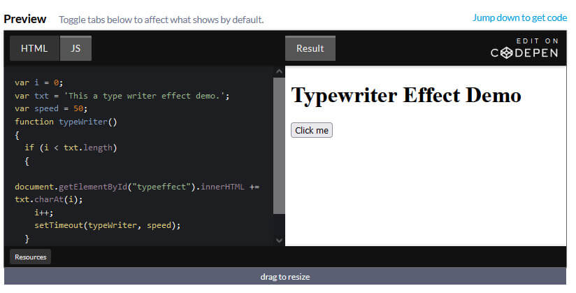
How to add Typing Effect / Type Writer Effect to your text Using JavaScript
By Richard
/ June 5, 2022
How to add Typing Effect / Type Writer Effect to your text Using JavaScript Step 1) Add HTML: <h1>Typewriter</h1>...
Read More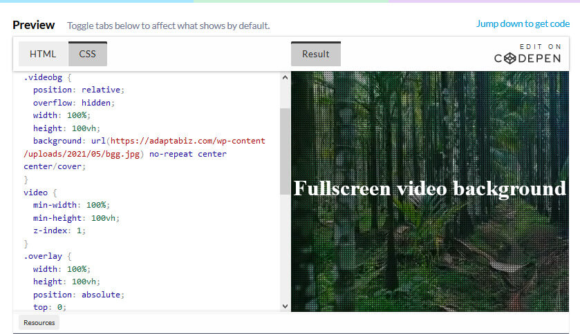
How to Create a full screen video background using HTML, CSS
By Richard
/ May 22, 2022
Learn How to Create a full screen video background using HTML, CSS Adding HTML <div class="videobg"> <video src="https://adaptabiz.com/wp-content/uploads/2021/05/Pexels-Videos-1234162.mp4" loop muted...
Read More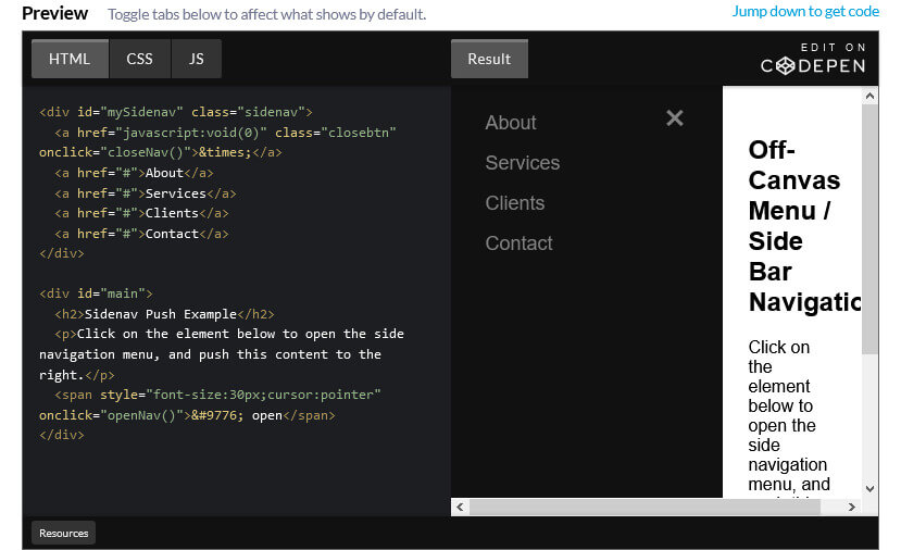
How to Create an Off-Canvas Menu / Side Bar Navigation
By Richard
/ April 29, 2022
How to Create an Off-Canvas Menu / Side Bar Navigation Step 1) Add HTML: <div id="mySidenav" class="sidenav"> <a href="javascript:void(0)" class="closebtn"...
Read More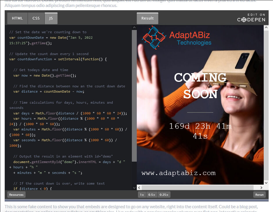
How To Create a Coming Soon Page / Maintenance Page Using HTML, CSS and JavaScript
By Richard
/ April 19, 2022
How To Create a Coming Soon Page / Maintenance Page Using HTML, CSS and JavaScript Step 1 : Adding...
Read More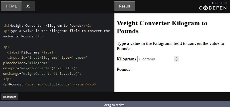
How to Create Weight Converter using HTML and JavaScript
By Richard
/ April 2, 2022
How to Create Weight Converter using HTML and JavaScript For Converting Pounds to Kilogram Adding HTML : <h2>Weight Converter Pound...
Read More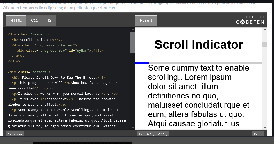
How to create a Scroll indicator with CSS and JavaScript
By Richard
/ February 19, 2022
How to create a Scroll indicator with CSS and JavaScript Step 1) Add HTML: <div class="header"> <h2>Scroll Indicator</h2> <div...
Read More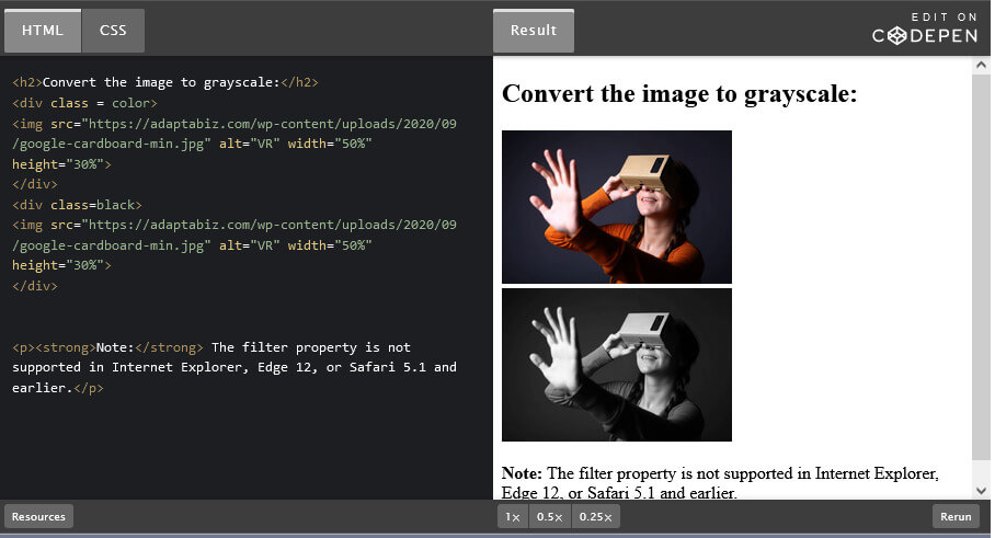
How to Convert Color image to Black & White using CSS Filter ( Color to Grayscale)
By Richard
/ February 15, 2022
Many a times, there is necessity of converting Color image into Black and White or Grayscale. Here in this very...
Read More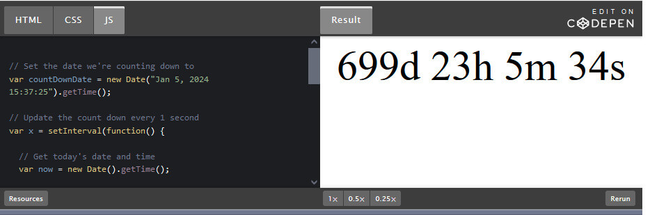
How to Create a JavaScript Countdown Timer
By Richard
/ February 4, 2022
There are many a times, when you’re going to need a countdown clock for your project. You may have an...
Read More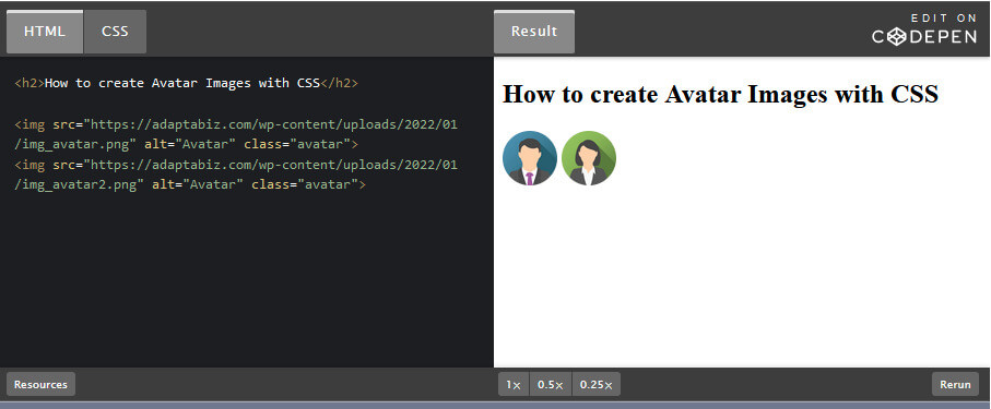
How to Create an Avatar image with CSS
By Richard
/ January 20, 2022
How to Create an Avatar image with CSS Step 1) Add HTML: <h2>How to create Avatar Images with CSS</h2> <img...
Read More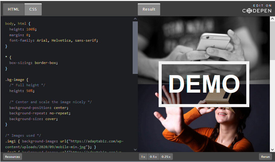
How to Change Background Images on Scroll with CSS.
By Richard
/ January 13, 2022
How to Change Background Images on Scroll with CSS. Step 1) Add HTML: <div class="bg-image img1"></div> <div class="bg-image img2"></div>...
Read More